Key Insights
(You'll find these expanded upon below.)
- The visually impaired community feels profoundly unheard.
- Communicating with visually impaired users about layout and functionality is difficult without the availability of visual aids or gesturing.
- Visually impaired users draw from a huge vocabulary of screen-reader-specific gestures; using a screen reader necessitates a very high cognitive load.
- Because visually impaired users navigate through interfaces by swiping left and right, their mental models for these interfaces are often horizontal.
- Hulu's switch to vertical scrolling on mobile is unintuitive to visually impaired users, while Netflix's horizontally scrolling carousels naturally adheres to their
mental models.
Design Challenge
In November of 2017, Hulu faced a class action lawsuit over a lack of audio description in its programming and the general inaccessiblity of their website and mobile applications.
In a pioneering educational partnership between Hulu and Santa Monica College, my cohort was challenged to design a more accessible media service for people with special needs.

Audience
Though Hulu’s design challenge was completely open-ended, my team of four democratically decided to research how the visually impaired community uses Hulu.
This was backed by the fact that 1.3 BILLION people struggle with some sort of visual impairment.
Preliminary Research
Understanding our community.
WAYFINDER FAMILY
SERVICES
We began our research at this facility, which provides services to individuals of all ages and disabilities, but primarily to the visually impaired.
We engaged in a round table discussion with their staff, all of whom are blind or visually impaired, and they were generous enough to provide us with a tour of their facilities.

Our Users
We arranged for in-home interviews and testing sessions with 3 individuals from Wayfinder Family Services, allowing us to observe, understand, and advocate for our participants.

BRIAN
35 years old, low vision due to retinal degeneration.
He works at Wayfinder, helping the visually impaired find jobs and build career skills. As a technological evangelist, he is always trying to push his comfort zone. Brian uses both Android and iOS devices.

Kate
21 years old, fully blind since age 7.
She is a full-time student studying Child Development for the visually impaired. She uses her computer and iPhone daily, but is frequently frustrated by websites that are not accessible.

LUIS
30 years old, fully blind since birth.
Luis uses his iPhone as his primary device for streaming. He is also very active on Facebook, Instagram, Snapchat, and Twitter.
How They Discover & View Content
This is a screen reader
It's the de facto method of interaction with technology for visually impaired users.
It gives users a cursor, which wraps itself around elements, and reads them aloud systematically (from top-left to bottom right). Its position is controlled with left/right swipes, and activating an element -- what sighted users are used to triggering with single taps -- requires a double tap. The cursor can also be controlled by dragging the finger along the display, reading aloud whatever the finger is currently above, but this is rarely the default method of exploring a new interface for screen reader users.
Much has been written about the knock-on effects of screen reader usage and how to design with them in mind. To summarize, screen readers carry a very high cognitive load (akin to the experience of being read a long list of "Specials" at a restaurant, only much more complex) and designers should strive to minimize this cognitive load whenever possible.
Key Insights
The visually impaired community feels profoundly unheard.
All of our participants above, as well as the staff that we spoke to at Wayfinder, expressed a variety of pain points, most of which revolved around their needs and preferences being secondary to those of sighted users.
Communicating with visually impaired users about layout & design is difficult.
Privileged with sight, my teammates and I found ourselves relying on gestures and visual aids (such as sketches and diagrams) when discussing these topics.
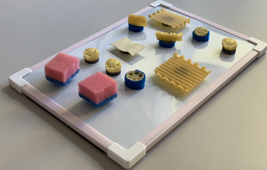
We therefore set out to create a toolkit to give unsighted users a seat at the design table, allowing them to express their desires in a tactile form.
DesignBridge v1
Click To Zoom
Tap To Zoom

In our interviews, this playful toolkit became the bridge of communication between the sighted and the visually impaired, allowing our participants to co-create and communicate their spatial mental models.
Step 1
Recreate a screen to show us your existing mental model.
Assign meaning to the shapes you choose; they represent the elements onscreen that you interact with.
Step 2
Show us how you would change that screen.
User Testing Insights
Controlling playback is clunky
Competitors (namely Netflix) place the pause/play button near the bottom-right screen corner, which makes it easily reachable/find-able by screen reader users (and has a curb cut effect, in that it is also more easily reachable for non-screen reader users).
They also hint at the available interactions for a specific element as the cursor highlights it: most notably, the universal gesture for pausing media --a two finger double tap. Reminding users of this lessens their (already high) cognitive load.
By contrast, Hulu's central play button position requires several swipes to reach by screen reader, a problem compounded by the lack of input hinting.
When a key task is unnecessarily far down the sequential list of elements, it is not uncommon for users to think they've mis-placed the cursor (by accidentally brushing a different part of the screen, for instance) or that the task is unachievable, as with one participant in the GIF above.
Discovery Isn't happening
The Hulu app suffered from a critical bug that caused the screen reader cursor to read only the category headings in the top navigation before skipping all of the content and reading the bottom navigation.
Brian circumvented this by discovering new content via review videos on YouTube, but our other two participants only found new content by searching for it by name.
In other words, they never discovered new content through browsing.

Kate’s toolkit exercise was particularly illuminating -- she said that she was laying out categories, but that they were empty. Because the content wasn't being read by the screen reader, it did not appear in her mental model.
Hulu's layout clashes with the natural (horizontal) mental models of screen reader users.
Because screen reader users navigate through the sequentially-read list of elements by swiping left and right, their mental models for most layouts are horizontal. Kate's "empty categories" exercise above illustrates this very well.
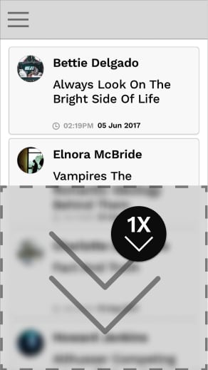
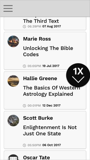
However, Hulu recently adopted a vertically scrolling layout on iOS (see below). This layout clashes heavily with the naturally horizontal mental models formed by screen reader users. Note that Netflix's interface is entirely horizontally scrolling carousels, which mesh very well with the mental models of visually impaired users.


Compare Kate's horizontal mental model of the "Browse" activity with the vertically scrolling screens on Hulu's iOS app.

Kate's playback screen representation featured a vertical set of beads, which represent a timeline.
This is because, with a screen reader, users increment values (like the time value on a timeline) by swiping up and down.
This is just one of the many, many gestures required for rich interaction through a screen reader.
DesignBridge v2

Concept
How can we bridge the communication gap between sighted and visually impaired designers?
The surface was also changed from felt to a magnetic surface with a raised border, to better accomodate users who reported a fear of losing any of the (many) items in our toolkit.
User Testing Results
Tap to Zoom
Click to Zoom

Next, we returned to Wayfinder and scheduled our largest user test yet, with 15 (!) participants.
The focus of the test was DesignBridge itself, with the goal to gain feedback on how to better improve the components therein.
Most participants used all or all but 1 category of pieces in DesignBridge.
Multiple participants lifted the board off the desk without fear of losing any pieces, in stark contrast to the careful behaviors we noticed in v1.
Our participants rated the prototype, on average, a 4.4 out of 5 usefulness on a Likert scale.
Some participants thought they were being tested on their memory, attempting to recreate layouts with 1-to-1 parity to their screens.
Once they were assured that the toolkit itself was being tested, and to be used as a tool to discuss layout, things went more smoothly.
This prototype of DesignBridge was missing acrucial component present in v1: Dividers. Several participants requested a divider element.
This is likely because the screen reader presents onscreen elements as very discrete, distinct items, and so are central to many participants' mental models.
Main benefit
DesignBridge provides visually impaired users with a physical vocabulary to communicate thoughts about layout, interaction, and design as a whole.
With this, they are finally given a seat at the design table.
Addendum: DesignBridge v3

Months after the project sunsetted, I felt the need to return to it. Macaroni and sponges, while effective rapid prototyping tools, did not make for a cohesive, brandable, or scalable product.
I decided on 5 basic components and a divider piece (as that was sorely missed by participants when testing v2).
In the process of designing these pieces, I learned the following:
The newly-designed components have a cohesive identity and visual language.
Because the designs have been standardized, this version of DesignBridge could easily be scaled to accommodate a design team of any size.
The components share a common medium, PLA Plastic. This means that a key factor present in previous versions of DesignBridge is no longer present: variation in texture.
Participants were forced to distinguish pieces by the designs on their top faces, which are on too large of a scale to be considered texture. There is also no flexible element, such as the sponge.
Reflection


presentation to hulu
At the conclusion of our research, we presented our findings to executives and designers at Hulu. Feedback was overwhelmingly positive, with members of the design team remarking that they were working on implementing the changes we suggested ASAP.
hulu as a partner
Hulu was tremendously supportive throughout the course of this project. Each of our working groups were assigned a designer mentor, and many groups reported their mentors putting in much more than the minimum 1-hour-per-week asked of them as part of the project.
At the final presentation, designers from within the company gave us their undivided attention and supplied us with thoughtful questions during the Q&A session.
looking forward
In the future, I would test with a larger sample size (we had 15 total in our final testing session) in order to gain more usable data, and conduct a dry run of our larger-scale test to better prepare for eventualities.
In future iterations, elements in DesignBridge could be given unique IDs and their movement could be tracked, allowing for remote monitoring or playback of testing sessions.
DesignBridge also has tremendous potential to give voices to other underrepresented communities, such as the elderly and individuals with autism, both of which may have difficulty sketching or articulating their needs verbally.
Sources
Below is a selection of findings that helped fuel our research, as well as high-level summaries of the applicable insights.
Participatory Design with Blind Users: A Scenario-Based Approach
This article was the main inspiration for our creative toolkit. In it, the authors heavily involve blind users in their design process through a co-creative approach.
Read ArticleNeilsen norman - Screen Readers on Touchscreen Devices
People who are blind or have low vision must rely on their memory and on a rich vocabulary of gestures to interact with touchscreen phones and tablets. Designers should strive to minimize the cognitive load for users of screen readers.
Read ArticleUsable Gestures for Blind People: Understanding Preference and Performance
Blind users may have limited knowledge of symbols used in print writing (letters, numbers, or punctuation), may be less precise in targeting specific areas on screen, and may perform gestures at a different pace than sighted people.
Read ArticleHCI Design for People with Visual Disability in Social Interaction
Due to the lack of gaze communication and eye contact, full communication is not happening between sighted and visually impaired people, so authors create an interactive system designed to facilitate more efficient face-to-face communication for people with visual disability in social interactions.
Read ArticleWhat Frustrates Screen Reader Users on the Web-2007
The vast majority of issues that screen reader users have with the web can be easily solved with proper development practices.
Read ArticleA user-centered design and analysis of an electrostatic haptic touchscreen system for students with visual impairments
A team of fourteen researchers at the University of Maryland set out to study visually impaired students' interaction with electrostatic haptic feedback, hoping to identify lines and shapes that make user-centered interaction more productive.
Read Article


