AutoScroll

AutoScroll

AutoScroll

a

case

study

by

mordechai

hammer

AutoScroll

What if we only had one screen?

Context

Solo project for my UX 2 course, in which we were challenged to seek out tasks that users turned to their desktops to conduct, redesigning them for the mobile paradigm.

PROJECT SUMMARY

Seeking to solve for the fast-approaching reality wherein mobile is our primary use-case, I created a microinteraction to allow users to continuously scroll, a task (still) exclusive to desktop browsing.

TIMELINE

2 months (April 2017 - May 2017)

TEAM MEMBERS

Mordechai Hammer

No items found.

TEAM MEMBERS

Mordechai Hammer

No items found.

MY ROLE

This was a project conducted entirely solo, and so I was completely responsible for tasks in the following categories:

  • Creating User Surveys
  • Conducting User Research
  • Paper Prototyping
  • Wireframing
  • Creating Information Architecture / User Flows
  • Visual Design
  • User Testing
  • Producing Motion Graphics
After Effects Logo
01
02
03
04
05
06

Key Insights

(You'll find these expanded upon below.)

  • We don’t necessarily need to crack down on bad actors to change bad behavior in an ecosystem.
  • If we target motivations, we can change rider (or user!) behavior for the better.
  • If we create a culture where it is assumed that riders behave a certain way, we are more likely to change rider behavior.
  • The motivations of Bird riders are diverse and multi-faceted. This is doubly so for the specific subsection of SMC Bird riders, though they revolve mainly around mobility and fun.
  • Stress the privacy and prosocial outcomes (and allow for progressive disclosure) when asking users to share personal data.

Project Introduction

Design challenge

How might we design a sustainable & equitable loyalty program for students at SMC?

Problem statement

Though Bird is privileged with brand recognition and reach that its competitors lack, it has not earned customer loyalty in the crowded micromobility market.

key stakeholders

Bird, SMC Administration, SMC Police Dept, SMC Students, Bird Riders

our big idea

Integration with an existing SMC platform (Corsair Commute) to log rides and reward depositing scooters in preferred parking with points to redeem towards scaling reservation privileges at preferred parking zones.

risk factors

This program relies upon spreading awareness of Corsair Commute platform (which so far has been sorely neglected).

This program also relies heavily upon economies of scale (it is difficult to provide reservations at preferred parking without people supplying the scooters there beforehand).

Process

Preliminary Research

goal

Because this project required an in-depth understanding of a market relatively unknown to our class, we set out to build a rich world of research around the micromobility market. Each student self-assigned themself to category of personal interest.

behavioral change

I began by focusing on the topic of behavioral change and how different organizations had tackled the challenge of creating and enforcing pro-social group norms.

Public Service Announcements -Good Manners, Good Tokyo!

Even in a country dominated by social norms, there will be bad actors. In Sept 2016, the Japanese government established Good Manners, Good Tokyo! 

This PSA campaign infused a mix of discouraging anti-social behavior (white background) and positive reinforcement of pro-social behavior (yellow background).

Japanese man sneezing on another subway passenger, others look in shock

The current Good Manners, Good Tokyo! campaign eschews the more overt shunning present in the earlier campaign in favor of emphasizing the positive choice while illustrating the effects of anti-social behavior.

I reached out to the folks at the Tokyo Good Manners Project, hoping to have a conversation about the outcomes of this project and how they measure or define success, but they declined to comment.

A step forward in Challenging Negative Online Behaviors -Jeffrey Lin

This article showed that, in one of the largest semi-anonymous communities, the worst 1% of users contribute to only 5% of overall toxicity on the platform

The remaining 95% of toxic behavior came from moderate or positive users having a rare outburst.

Illustration of Jeffrey Lin
Jeffrey Lin

Neuroscientist

Former director of player behavior at Riot Games

We learned that removing the most toxic players in League of Legends does not solve the online player behavior problem.

Read Article

We don’t necessarily need to crack down on bad actors to change bad behavior in an ecosystem.

Insight!

The First Online Player Behavior Experiment at Riot Games - Jeffrey Lin

In 2015, Riot Games (developers of League of Legends, a video game with an infamously toxic player base) asked a question:

What if we made the cross-team chat channel an opt-in feature?

The results were staggering.

79%

of players opted in

32.7%

in negative chat.

Their experiment paid off, and people were not being as mean to each other.

34.5%

in positive chat.

But that's not all! People were actually nicer to each other.

This experiment yielded positive results because the Player Behavior Team targeted the motivations of the toxic outbursts - the desire to get a rise out of your target.

The possibility of their target not being in the same channel meant that most players decided not to waste their time shouting into the void.

Read Article

If we target motivations, we can change rider behavior for the better.

Insight!

Group identification as a mediator of the effect of players’ anonymity on cheating in online games - Vivian Hsueh Hua Chen

This study demonstrates that, while people definitely cheat more in anonymous settings, while in a de-individuized (semi-anonymous) state, their decision making is strongly influenced by the norms of the group they are in.

This is in contrast to the common belief that any degree of anonymity necessitates bad behavior.

Illustration of Jeffrey Lin
Vivian Hsueh Hua Chen PHD

Associate Professor (Communication)

Nanyang Technological University

Read study
A lightbulb

Insight!

If we create a culture where it is assumed that riders behave a certain way, we are more likely to change rider behavior.

Convergence

goal

With a foundation of research in various topics, it was time for the students in my class to pool our knowledge into something greater than the sum of its parts.

Workshop: Ecyosystem map

We conducted this 5-hour workshop in order to gain a holistic view of the ecosystem Bird operates within. This includes the stakeholders, flow of goods and services, and needs of SMC students.

Details about each step can be found inside the adjacent lightbox's captions.

Tap to Zoom

Click to Zoom

Ecosystem map

After completing the workshop, I digitized our final amalgamation of sticky notes into the following ecosystem map, representing the needs of SMC Students and visualizing stakeholders on three tiers.

Digitizing the results of our exercise helped me realize that several of the items did not fit neatly into one category or another. Gradients then became a useful tool to illustrate the ambiguous nature of goals like “See the City” and “Race Scooters”.

A lightbulb

Insight!

The motivations of Bird riders are diverse and multi-faceted. This is doubly so for the specific subsection of Bird riders at SMC, though they revolve mainly around mobility and fun.

Concept Generation

goal

The goal at this stage was for my teammate and I to align our visions on a singular north-star concept, allowing us to test with intentionality in future phases.

observation: scooters aRE STREWN ABOUT campus HAPHAZARDLY

Scooter parked just outside designated drop zoneScooters strewn about campus

Both my colleague Florence and I noticed that the preferred parking zones on campus were often left empty, with most students tending to leave their scooters outside them, sometimes mere feet away.

survey: why do you park scooters outside of these zones?

The lack of respectful parking was clearly a problem, but (as we learned earlier) in order to change students' behavior around parking, it is necessary to target their motivations for parking in that way.

The first step toward targeting motivations is identifying them, and so we set out to do just that, surveying 20 students on the topic.

We identified the following motivations for parking outside of the preferred parking zones:

  • Ignorance - some students didn't know that preferred parking zones even existed on campus. (20% of responses)
  • Convenience -many students knew of their existence, but simply dropped their scooter close to their destination, which was not always near the preferred parking zones. (70% of responses)
  • Securing a ride back -some students knew of their existence, but simply dropped their scooter close to their destination, which was not always near the preferred parking zones. (10% of responses)

Concept direction

Florence and I settled on a loyalty program that would integrate with an existing Santa Monica College service (Corsair Commute) to log Bird trips and reward depositing scooters in preferred parking with points to redeem towards scaling reservation privileges at preferred parking zones

corsair commute

Corsair Commute allows students to plot routes to & from home/work/school, giving them different transit options (bus, bike, Waze Carpool, etc) and the relative carbon footprints of each.

Trip logging

We propose adding Bird as a transit option in Corsair Commute, and adding crowdsourced metadata such as safety or cost.
Trips originating or terminating at any SMC campus would earn a small amount of points.

Bird catching

Depositing scooters in preferred parking zones (we called this Bird Catching) around campus would earn a larger amount of points, with the point value per scooter increasing when deposited in bulk.

what are the points for?

We propose incentivizing with scaling reservation periods (the more points you have, the longer you can reserve), because it directly targets all 3 identified motivations for not parking in preferred parking.

Prototypes

goal

A concept cannot be validated until it takes a testable form. For this reason, we created physical and digital prototypes in order to test our concept among SMC students.

user flows

Because this concept relies so heavily on integrating with an existing infrastructure, we wanted to ensure that the process of linking a user's Bird and Corsair Commute accounts was well thought-through. Therefore, the first artifact created was a user flow of that process and supporting processes.

User flow for signing up for SMC Bird Rewards

Tap to Zoom

Click to Zoom

User flow for signing up for Bird Catching

Tap to Zoom

Click to Zoom

My teammate also created a user flow to document the recruitment (and further prompting when Birds are in-demand at a certain campus) into the Bird Catcher program.

We presented these flows to industry professionals at a school-sponsored Work-In-Progress night for feedback. It was positively received, though the main feedback note received was to compartmentalize the flows in order to make it more digestible. (This has been done above, compartmentalized by platform.)

paper prototypes

Next, we created paper prototypes to illustrate the flows to students on campus, paired with user interviews of the same students.

results from testing sessions & interviews

We learned several things from our "Donuts for Data" initiative.

Students heavily value convenience when choosing their scooters.

I usually just grab whichever scooter is on my block.

- Prakash

We must ensure supply of Birds near the students if they will not walk the extra block to the nearest Bird.

Insight!

Students are extremely receptive to the concept of reserving scooters based on incentive.

100% of the 10 students we surveyed said they would be motivated to earn points towards this incentive.

Students were hesitant to share data about their rides until the privacy and prosocial outcomes were clear.

Several of the students expressed concern about sharing data, but all of those students' fears were soothed when it was made clear that their datawould only be shared withother SMC students

I don’t want to share my route because I don’t want people to know where I go.

- Juliette

If it’s going to help other students, I’d definitely share.

- Leo

Stress the privacy and prosocial outcomes (and allow for progressive disclosure) at the Share stage of the flow.

Insight!

Students were completely unaware of the Corsair Commute service.

90% of 40 SMC students surveyed had never heard of Corsair Commute and only 5% had used it.

That’s only two students who had ever used the service -- and one of them had, by coincidence, helped launch the service on campus.

Santa Monica College stands to gain tremendously by incorporating this program, as it will encourage use of an underused platform they've already paid to develop.

Insight!

Final Product

goal

In this stage, we endeavored to create an interactive digital flow based on the feedback we received in the Prototypes stage.

However, this would only be one artifact of the entire proposed loyalty program, which would require advertisement campaigns (on campus, in-app, and on Corsair Commute), some digital infrastructure development (rider profiles in-app, to log points), and collaboration between Bird and RideAmigos (the developers of Corsair Commute, who we contacted and were eager to begin talks with Bird).

You can access this prototype on your device.

Reflection

feedback from bird

At the conclusion of the semester, we presented our loyalty program to executives and designers at Bird.

The only feedback note received directly from the Bird employees was that this was an excellent solution for our specific campus, and (depending on how many campuses are using similar systems) it could also be scalable. 

Being that 40+ campuses use the platform Corsair Commute is built upon, and that it is built with the intention of integrating with third-party solutions, we believe it is an incredibly appropriate, successful response to the design challenge.

what worked

  • The concept of receiving reservations as an incentive was incredibly attractive to all students surveyed.
  • When surveying students, we realized
  • Relying on existing (digital) infrastructure and part-time employment in exchange for reservation incentive would be a very low-cost model to generate loyalty. 

The concept of receiving reservations as an incentive was incredibly attractive to all students surveyed.

Relying on existing (digital) infrastructure and part-time employment in exchange for reservation incentive would be a very low-cost model to generate loyalty. 


what didn't work

The concept was decidedly understated and less “flashy” than other projects in the cohort, most likely due to relying heavily on already-established infrastructure. Perhaps there was something more that could’ve been done in our presentation of the concept to garner more attention?

Bird may have already considered/been considering implementing reservations, but they were rather tight-lipped about whether that was specifically the case, nor whether they considered our specific implementation thereof.

Cameras were forbidden during our presentation, but at least I got this cool picture of their front desk.

01
02
03
04
05
06

Key Insights

(You'll find these expanded upon below.)

  • The visually impaired community feels profoundly unheard.
  • Communicating with visually impaired users about layout and functionality is difficult without the availability of visual aids or gesturing.
  • Visually impaired users draw from a huge vocabulary of screen-reader-specific gestures; using a screen reader necessitates a very high cognitive load.
  • Because visually impaired users navigate through interfaces by swiping left and right, their mental models for these interfaces are often horizontal.
  • Hulu's switch to vertical scrolling on mobile is unintuitive to visually impaired users, while Netflix's horizontally scrolling carousels naturally adheres to their
    mental models.

Process

Design Challenge

In November of 2017, Hulu faced a class action lawsuit over a lack of audio description in its programming and the general inaccessiblity of their website and mobile applications.

In a pioneering educational partnership between Hulu and Santa Monica College, my cohort was challenged to design a more accessible media service for people with special needs.

Eye with line across it horizontally

Audience

Though Hulu’s design challenge was completely open-ended, my team of four democratically decided to research how the visually impaired community uses Hulu.

This was backed by the fact that 1.3 BILLION people struggle with some sort of visual impairment.

Preliminary Research

Understanding our community.

WAYFINDER FAMILY 
SERVICES

We began our research at this facility, which provides services to individuals of all ages and disabilities, but primarily to the visually impaired.

We engaged in a round table discussion with their staff, all of whom are blind or visually impaired, and they were generous enough to provide us with a tour of their facilities.

Wayfinder Family Services

Our Users

We arranged for in-home interviews and testing sessions with 3 individuals from Wayfinder Family Services, allowing us to observe, understand, and advocate for our participants.

BRIAN

35 years old, low vision due to retinal degeneration.

He works at Wayfinder, helping the visually impaired find jobs and build career skills. As a technological evangelist, he is always trying to push his comfort zone. Brian uses both Android and iOS devices.

Kate, a young woman in her home

Kate

21 years old, fully blind since age 7.

She is a full-time student studying Child Development for the visually impaired. She uses her computer and iPhone daily, but is frequently frustrated by websites that are not accessible.

Luis, a young man on his couch holding a phone

LUIS

30 years old, fully blind since birth.

Luis uses his iPhone as his primary device for streaming. He is also very active on Facebook, Instagram, Snapchat, and Twitter.

How They Discover & View Content

This is a screen reader

It's the de facto method of interaction with technology for visually impaired users.

It gives users a cursor, which wraps itself around elements, and reads them aloud systematically (from top-left to bottom right). Its position is controlled with left/right swipes, and activating an element -- what sighted users are used to triggering with single taps -- requires a double tap. The cursor can also be controlled by dragging the finger along the display, reading aloud whatever the finger is currently above, but this is rarely the default method of exploring a new interface for screen reader users.

Much has been written about the knock-on effects of screen reader usage and how to design with them in mind. To summarize, screen readers carry a very high cognitive load (akin to the experience of being read a long list of "Specials" at a restaurant, only much more complex) and designers should strive to minimize this cognitive load whenever possible.

Key Insights

The visually impaired community feels profoundly unheard.

All of our participants above, as well as the staff that we spoke to at Wayfinder, expressed a variety of pain points, most of which revolved around their needs and preferences being secondary to those of sighted users.

Communicating with visually impaired users about layout & design is difficult.

Privileged with sight, my teammates and I found ourselves relying on gestures and visual aids (such as sketches and diagrams) when discussing these topics.

We therefore set out to create a toolkit to give unsighted users a seat at the design table, allowing them to express their desires in a tactile form.
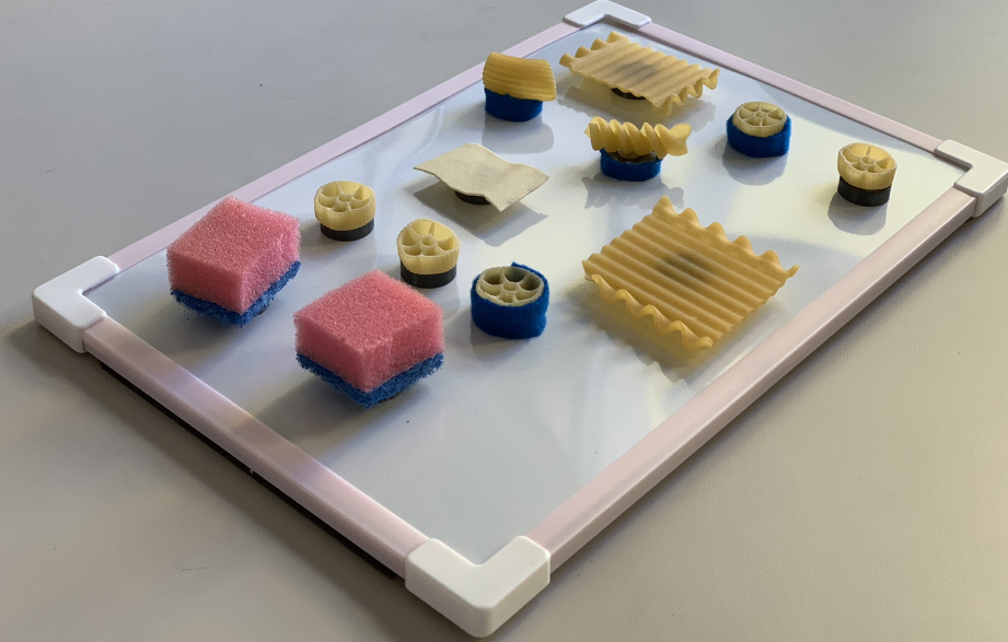
DesignBridge v1

Involving users in the design process

In our interviews, this playful toolkit became the bridge of communication between the sighted and the visually impaired, allowing our participants to co-create and communicate their spatial mental models.

Step 1

Recreate a screen to show us your existing mental model.

Assign meaning to the shapes you choose; they represent the elements onscreen that you interact with.

Step 2

Show us how you would change that screen.


User Testing Insights

Controlling playback is clunky

Screen-reader user swiping 26 times in order to reach the pause button in the Hulu app

Competitors (namely Netflix) place the pause/play button near the bottom-right screen corner, which makes it easily reachable/find-able by screen reader users (and has a curb cut effect, in that it is also more easily reachable for non-screen reader users).

They also hint at the available interactions for a specific element as the cursor highlights it: most notably, the universal gesture for pausing media --a two finger double tap. Reminding users of this lessens their (already high) cognitive load.

By contrast, Hulu's central play button position requires several swipes to reach by screen reader, a problem compounded by the lack of input hinting.

When a key task is unnecessarily far down the sequential list of elements, it is not uncommon for users to think they've mis-placed the cursor (by accidentally brushing a different part of the screen, for instance) or that the task is unachievable, as with one participant in the GIF above.

Discovery Isn't happening

The Hulu app suffered from a critical bug that caused the screen reader cursor to read only the category headings in the top navigation before skipping all of the content and reading the bottom navigation.

Brian circumvented this by discovering new content via review videos on YouTube, but our other two participants only found new content by searching for it by name.

In other words, they never discovered new content through browsing.

Kate’s toolkit exercise was particularly illuminating -- she said that she was laying out categories, but that they were empty. Because the content wasn't being read by the screen reader, it did not appear in her mental model.

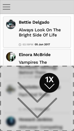
Hulu's layout clashes with the natural (horizontal) mental models of screen reader users.

Because screen reader users navigate through the sequentially-read list of elements by swiping left and right, their mental models for most layouts are horizontal. Kate's "empty categories" exercise above illustrates this very well.

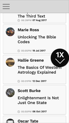
However, Hulu recently adopted a vertically scrolling layout on iOS (see below). This layout clashes heavily with the naturally horizontal mental models formed by screen reader users. Note that Netflix's interface is entirely horizontally scrolling carousels, which mesh very well with the mental models of visually impaired users.

Scrolling down a list of previously viewed titles on the Hulu iOS app

Compare Kate's horizontal mental model of the "Browse" activity with the vertically scrolling screens on Hulu's iOS app.

Kate's playback screen representation featured a vertical set of beads, which represent a timeline.

This is because, with a screen reader, users increment values (like the time value on a timeline) by swiping up and down.

This is just one of the many, many gestures required for rich interaction through a screen reader.

DesignBridge v2

Concept

How can we bridge the communication gap between sighted and visually impaired designers?

Guiding principle: USABILITY

Our participants reported information overload and only ended up using a limited number of the original parts. Therefore, we significantly reduced the number and variety of moving parts in our prototype, down from 50+ to 5:

A sponge

SPONGE

A Lasagna noodle

Lasagna

A rigatoni noodle

Rigatoni

A wagon wheel noodle

wheel

A fusilli noodle

fusilli

The surface was also changed from felt to a magnetic surface with a raised border, to better accomodate users who reported a fear of losing any of the (many) items in our toolkit.

User Testing Results

Next, we returned to Wayfinder and scheduled our largest user test yet, with 15 (!) participants.

The focus of the test was DesignBridge itself, with the goal to gain feedback on how to better improve the components therein.

Check Mark Icon

increased utilization of elements

Most participants used all or all but 1 category of pieces in DesignBridge.

Check Mark Icon

OFF-TABLE USAGE

Multiple participants lifted the board off the desk without fear of losing any pieces, in stark contrast to the careful behaviors we noticed in v1.

Check mark icon

positive sentiment

Our participants rated the prototype, on average, a 4.4 out of 5 usefulness on a Likert scale.

X Icon

Meaning of exercise sometimes unclear

Some participants thought they were being tested on their memory, attempting to recreate layouts with 1-to-1 parity to their screens.

Once they were assured that the toolkit itself was being tested, and to be used as a tool to discuss layout, things went more smoothly.

X Icon

Dividers were missed

This prototype of DesignBridge was missing acrucial component present in v1: Dividers. Several participants requested a divider element. 

This is likely because the screen reader presents onscreen elements as very discrete, distinct items, and so are central to many participants' mental models.

Main benefit

DesignBridge provides visually impaired users with a physical vocabulary to communicate thoughts about layout, interaction, and design as a whole.

With this, they are finally given a seat at the design table.

Addendum: DesignBridge v3

Version 3 of DesignBridge, with 3D printed components

Months after the project sunsetted, I felt the need to return to it. Macaroni and sponges, while effective rapid prototyping tools, did not make for a cohesive, brandable, or scalable product.

I decided on 5 basic components and a divider piece (as that was sorely missed by participants when testing v2).

In the process of designing these pieces, I learned the following:

Uniformity bodes well

The newly-designed components have a cohesive identity and visual language.

3d printing = scalability

Because the designs have been standardized, this version of DesignBridge could easily be scaled to accommodate a design team of any size.

Plastic is not the ideal medium for this product

The components share a common medium, PLA Plastic. This means that a key factor present in previous versions of DesignBridge is no longer present: variation in texture.

Participants were forced to distinguish pieces by the designs on their top faces, which are on too large of a scale to be considered texture. There is also no flexible element, such as the sponge.

Reflection

presentation to hulu

At the conclusion of our research, we presented our findings to executives and designers at Hulu. Feedback was overwhelmingly positive, with members of the design team remarking that they were working on implementing the changes we suggested ASAP.

hulu as a partner

Hulu was tremendously supportive throughout the course of this project. Each of our working groups were assigned a designer mentor, and many groups reported their mentors putting in much more than the minimum 1-hour-per-week asked of them as part of the project.

At the final presentation, designers from within the company gave us their undivided attention and supplied us with thoughtful questions during the Q&A session.

looking forward

In the future, I would test with a larger sample size (we had 15 total in our final testing session) in order to gain more usable data, and conduct a dry run of our larger-scale test to better prepare for eventualities.

In future iterations, elements in DesignBridge could be given unique IDs and their movement could be tracked, allowing for remote monitoring or playback of testing sessions.

DesignBridge also has tremendous potential to give voices to other underrepresented communities, such as the elderly and individuals with autism, both of which may have difficulty sketching or articulating their needs verbally.

Sources

Below is a selection of findings that helped fuel our research, as well as high-level summaries of the applicable insights.

Participatory Design with Blind Users: A Scenario-Based Approach

This article was the main inspiration for our creative toolkit. In it, the authors heavily involve blind users in their design process through a co-creative approach.

Read Article

Neilsen norman - Screen Readers on Touchscreen Devices

People who are blind or have low vision must rely on their memory and on a rich vocabulary of gestures to interact with touchscreen phones and tablets. Designers should strive to minimize the cognitive load for users of screen readers.

Read Article

Usable Gestures for Blind People: Understanding Preference and Performance

Blind users may have limited knowledge of symbols used in print writing (letters, numbers, or punctuation), may be less precise in targeting specific areas on screen, and may perform gestures at a different pace than sighted people.

Read Article

HCI Design for People with Visual Disability in Social Interaction

Due to the lack of gaze communication and eye contact, full communication is not happening between sighted and visually impaired people, so authors create an interactive system designed to facilitate more efficient face-to-face communication for people with visual disability in social interactions.

Read Article

What Frustrates Screen Reader Users on the Web-2007

The vast majority of issues that screen reader users have with the web can be easily solved with proper development practices.

Read Article

A user-centered design and analysis of an electrostatic haptic touchscreen system for students with visual impairments

A team of fourteen researchers at the University of Maryland set out to study visually impaired students' interaction with electrostatic haptic feedback, hoping to identify lines and shapes that make user-centered interaction more productive.

Read Article

Participatory Design with Blind Users: A Scenario-Based Approach

This article was the main inspiration for our creative toolkit. In it, the authors heavily involve blind users in their design process through a co-creative approach.

Read Article

Neilsen norman - Screen Readers on Touchscreen Devices

People who are blind or have low vision must rely on their memory and on a rich vocabulary of gestures to interact with touchscreen phones and tablets. Designers should strive to minimize the cognitive load for users of screen readers.

This article does an absolutely fantastic job of relating the experience of using a screen reader. Please read it.

Read Article

Usable Gestures for Blind People: Understanding Preference and Performance

Blind users may have limited knowledge of symbols used in print writing (letters, numbers, or punctuation), may be less precise in targeting specific areas on screen, and may perform gestures at a different pace than sighted people.

Read Article

HCI Design for People with Visual Disability in Social Interaction

Due to the lack of gaze communication and eye contact, full communication is not happening between sighted and visually impaired people, so authors create an interactive system designed to facilitate more efficient face-to-face communication for people with visual disability in social interactions.

Read Article

What Frustrates Screen Reader Users on the Web-2007

The vast majority of issues that screen reader users have with the web can be easily solved with proper development practices.

Read Article

A user-centered design and analysis of an electrostatic haptic touchscreen system for students with visual impairments

A team of fourteen researchers at the University of Maryland set out to study visually impaired students' interaction with electrostatic haptic feedback, hoping to identify lines and shapes that make user-centered interaction more productive.

Read Article
01
02
03
04
05
06

Process

Background

goal

Before transposing a microinteraction from the desktop to mobile paradigm, it is important to first understand the lay of the land. Just how common is mobile web usage?

SOURCE: BGR

INTERNET USAGE WORLDWIDE - OCT 2009-2016

Tech users today task-switch from desktop to mobile, and back again, nimbly hopping from their phones and tablets to desktops without batting an eye.

While this pattern is commonplace in the USA, mobile usage is slowly ticking upwards, with global mobile internet usage usurping desktop’s majority share in 2016.

Besides that, mobile has long been the default form factor in emerging markets, where users haven’t the money to spare on multiple devices.

My mission in this exploration was to bridge the gap between desktop and mobile through a microinteraction that would provide functionality currently limited to desktops.

While user behavior is trending towards these smaller sized screens, many tasks have yet to be optimized for this smaller form factor.

Insight!

User Interviews

goal

In order to discover precisely which types of tasks are difficult or impossible on mobile, I began by conducting a series of user interviews, with users representing 3 distinct demographics, asking them which task they most frequently turn to their computers to achieve.

Michelle H., a woman in her 20s looking into the camera

Michelle h.

Age:

24

TECH COMFORT:

High Tech Comfort

Michelle is an art director at a virtual reality gaming startup, and therefore is completely at-ease with technology of all kinds.

In her office at work, she rarely worries about turning her desktop on or off, because their power schedule is automated.

Such a task is, as of 2017, unavailable on most smartphones.

TASK: Scheduled power on/off

This task seemed too niche -- most people rarely power down their cell phones, preferring to plug them in overnight. Besides, the scope of this task was perhaps too narrow to focus on for an entire semester.

Raphael B, an old man holding an iPhone to his face

RAPHAEL B.

Age:

72

TECH COMFORT:

Low Tech Comfort

Raphael is blind. He owns an iPhone, but he mainly uses it as a radio. He does not consider himself proficient with it at all.

Typing longer bodies of text is often cited as a frustration by sighted individuals, but it is especially difficult for the blind. He always prefers a tactile, mechanical keyboard.

TASK: Typing an email

This task was unfortunately beyond the scope of this assignment -- the touchscreen keyboard does need work, but redesigning it would have been impossible within this time frame.

Reijo H., a middle-aged man looking directly into the camera and wearing a suit

rEIJO h.

Age:

45

TECH COMFORT:

Medium Tech Comfort

Reijo is a finance executive at a Finnish forestry corporation. He owns a desktop, laptop, and 2 mobile phones, though he is only moderately comfortable on any of them.

Reijo often receives long documents in emails, and must switch to desktop in order to scan these long documents in his preferred manner -- the middle-click autoscroll function.

TASK: Continuous Automatic Scroll

This task, however, was the perfect blend of challenge and familiarity; it was appropriately intricate for the 3-month timeframe of this assignment, and also usable by a large swath of mobile users (anyone who regularly views content larger than their device viewport).

Task Focus

goal

One must fully understand the task at hand before redesigning it. In this section, I will break down the micro interaction in its entirety — the trigger, rule, and any applicable loops and modes.

TRIGGER

When middle clicking (pressing in on the scroll wheel) on a desktop mouse, the viewport enters a distinct mode, and the user is given visual feedback in the form of their cursor changing:

A pointer cursor turning into a circle with four directional arrows inside it

RULE

Moving the cursor from its position at the time of the trigger results in the viewport scrolling continuously in the direction moved.

Scroll speed scales with distance from initial trigger point, capping at ~3x the initial value.

Moving the cursor also gives another stage of visual feedback, with the cursor changing once again:

The elliptical body disappears, along with all directional arrows except for the one corresponding to the chosen scroll direction (down is assumed in this case).

LOOP / MODE

This mode loops until the viewport reaches one end of the document, but the mode can be exited in several ways:

  1. Left or right clicking anywhere on the screen
  2. Alt-tabbing to another application window
  3. Hitting the Esc key

Proposed Solution

AUTOSCROLL TRIGGERED BY 3D TOUCH

The trigger for this microinteraction on desktop is delegated to an otherwise rarely used input -- the middle click.

Translating this to mobile was, at first, difficult; many gestures on mobile have clearly defined uses and something as nearly-ubiquitous as this microinteraction would require an input that would rarely be used otherwise.

Thankfully, Apple introduced 3D Touch with their iPhone 6S model.

This input is oft-overlooked, for one main reason:

Our habits obscure its function.

While some content can be 3D touched in order to preview it, there is no visual signifier to distinguish such content.

The most accessible opportunity most people have to use 3D Touch is to reveal widgets (or task shortcuts) for icons on their home screen.

This function is acessible only if the user overrides the heavily-ingrained pre-existing habit to simply tap the app icon theywish to launch. Once tapped, the potential time savings via 3D Touch are lost; most tasks can be accomplished from the main screen of a given app faster than backtracking to the home screen, 3D Touching, and then selecting the task shortcut.

My proposed microinteraction provides a perfect opportunity to introduce 3D Touch to a variety of users -- almost every user regularly views content larger in one dimension than their viewport, and as long as they are not near the edge of the content, this function should be useful.

Hand holding phone accessing map shortcuts via force touch on home screen

3D Touch Shortcuts

Concept Development

Click to Zoom

Tap to Zoom

Rudimentary User Flow

After narrowing my task down to continuous automatic scrolling, I created some low-fidelity wireframes and a rudimentary user flow.

Because I was still exploring different options, I included multiple potential outcomes for the second state.

User Testing

round one: paper prototypes

I created a set of paper prototypes (unfortunately not pictured) and conducted my first round of user testing, with two subjects.

I gained 3 key insights.

01

Automatic, continuous scrolling is pretty difficult to communicate via paper prototypes.

I found myself constantly asking my users to “imagine” that the content was scrolling before their eyes.

Even when I physically moved the content layer downwards, the test subjects had difficulty fully realizing the microinteraction.

02

Buttons pinned to the bottom right corner were too bulky / intrusive.

Up this point, the scrolling controls were pinned to the bottom right corner.

Users kept moving it out of the way, indicating that they wanted it to be less intrusive.

03

Many people are unaware of 3D Touch.

Neither user was aware of 3D Touch shortcuts, and this certainly does not bode well for the input method's longevity.

Mid-Fidelity Wireframes

goal

Based on the insights gained from my user-testing, I created some medium-fidelity wireframes to further develop the concept before additional testing.

1

This is a sample content container with a long list of cards, populated with vaguely philosophical content (thanks to Craft by InVision).

2

In order to respond to users’ complaints about the pinned-to-lower-right buttons being too intrusive, I designed a token dropping system:

When the user 3D Touches, the above token appears beneath their finger. Depending on where they drop it (top or bottom half of the screen), they will receive visual feedback in the form of a half-screen overlay.

Dropping the token (lifting finger) begins the scroll.

3

Once the scroll begins, the token floats off to the side, but is draggable/flickable to any screen edge (a la Facebook Chat Heads).

The scroll speed and direction is noted on the token, which can be tapped to increase the speed in the current direction, or dragged to the opposite half of the screen in order to begin scrolling in the opposite direction.

Flow Diagram (v1)

goal

In order to fully understand the system of interactions I was designing, I sketched out a rough flow diagram, to be refined later:

Sketches of potential microinteraction concepts and flows

User Testing

round two

I created another set of paper prototypes and brought it to the same test subjects, as well as one additional tester.

Once again, I gained 3 key insights.

01

Many people don't know that their desktop offers this functionality.

Only one of my test subjects selected at this stage knew that their computers offered a continuous autoscroll function.  

This may have been partially due to one subject primarily using Mac OSX on desktop, which does not include this functionality by default (except in select browsers).

02

Users wanted to swipe to control the scrolling speed.

This happened constantly throughout the testing.

Users reported frustration that, when in this mode, swiping had no impact on the scrolling speed or direction. I’d completely left it out of my original  flow diagram, and therefore out of my prototype.

03

Separate buttons might be more intuitive than a drag-and-drop system.

The half-screen overlays meant that, if the token floated to the opposite half of the screen (the top, while scrolling downwards, for example), the user could accidentally start scrolling in the opposite direction when trying to adjust their scroll speed in the current direction -- the exact opposite of their intention. 

Users also experienced a moment of confusion, afraid to “drop” their scrolling token due to lack of understanding the consequences of doing so.

The drag-and-drop token system may have been too inventive -- this is already a microinteraction that mobile users are unfamiliar with, and so it is likely best to leverage existing heuristics, such as distinct buttons for distinct parts of a function, with functionality for common gestures baked-in.

Flow Diagram(v2)

goal

Development of this microinteraction was an exercise in continually de-emphasizing the chrome of the autoscroller; users consistently felt it was too in-their-face.

In addition, the behavior was changed to closer mimic the behavior of the desktop interaction -- content now scrolls at a speed proportional to finger distance from initial 3D touch. Not only does this leverage users' potential familiarity with the desktop interaction, it allows for direct manipulation of the viewport.

However, the touchscreen form factor affords users the ability not only to drag (analogous to the click-drag), but also to swipe (or flick). Because users in previous tests defaulted to these gestures when trying to control the viewport, it was clearly important to attach functionality to them.

Click to Zoom

Tap to Zoom

Final Product

bringing my work to life

After watching Alex Cornell’s brilliant “Idea Vessels” talk, I felt deeply inspired. In this stage, I decided that the idea vessel I’d chosen in 2016 (a motion study, devoid of actual human interaction) was perhaps not the finest vessel in which to deliver this idea. It was relatively primitive, requiring me to be present to be properly conveyed.

So I set to work, filming, re-desiging my mock-ups, animating them, and compositing them onto a phone. The result is a (hopefully) convincing and immersive vision of what using AutoScroll could feel like. 

I hope you enjoy.

It’s nearly here, just a few finishing touches.

In the meantime, you can click here to view the original motion study. The new one is WAY better, I promise, but I'm still compositing it onto footage.

Reflection

GOAL

Without reflection, we learn little from our actions. In this section, I will review my design process and discuss my successes, failures, and how I might do things differently in the future.

OVERALL

Overall, this project was a deeply fulfilling pet project of mine. Firstly, 3D Touch is an input method that (at the time) was new, exciting, and had tons of potential; it added an analog dimension to a previously purely digital element (the screen). It also offered a natural tertiary input method (a la middle click on desktop) where one did not yet exist. 

Finally, 3D Touch unlocked a highly useful shortcut/widget layer on the home screen, which I personally used multiple times a day, meaning that I was invested in its future.

What worked

Well, I correctly forecasted two things: The first was the inevitable demise of 3D touch if Apple did not add a signifier to the OS to make it more obvious what could(n’t) be 3D touched, or add a universal 3D touch result. Apple has since removed 3D Touch from all of its newest generation of iPhones.

The second forecast was the usability of the shortcut/widget layer, and its lack of discoverability. Apple has since forced users to stumble upon this widget layer by forcing users to navigate through it in order to delete/re-arrange apps. 
I think that my micro interaction was also a successful response to the original prompt of imagining a desktop-only task for mobile. 

What DIDN'T worK

Using paper prototypes to demonstrate an interaction as fluid as this one was really tough. It was difficult to communicate swift motion in response to gestures, and I ended up asking participants to rely heavily on their imaginations, which means that I could not be 100% certain of what exactly they were picturing (and therefore not 100% confident in their feedback). In the future, I would work to develop a digital prototype (even if at lower fidelity) as soon as possible.

Finding participants who often use these tertiary inputs was also very difficult. I don’t think that this means that tertiary inputs should be removed in favor of simplicity, but it’s undeniable that Apple tends to lean more towards the minimalistic side of the spectrum.

Perhaps it would have been wiser to design this prototype for Android, where there are already ample examples of experimental tertiary inputs, and more “power users.” Unfortunately, 3D Touch is (paradoxically) proprietary Apple technology, and so it would make little sense to design for an input method that could never be brought to the platform.